Picture yourself walking down a busy high street.
Some shop windows make you slow down almost without thinking. You can see what they sell, who it is for, and why it might be worth stepping inside. Others are cluttered, confusing or forgettable. You glance at them, fail to understand the point, and keep moving.
Your website works in much the same way.
It may not have a literal window display, but it still has to earn attention quickly. Visitors arrive with limited patience, a specific need, and plenty of alternatives one click away. If the page does not make the offer clear, build trust and guide the next step, the opportunity can disappear before anyone reads the detail.
This is why website conversion rate optimisation matters. SEO and PPC can bring the right people to the site, but the website still has to help them take action once they arrive.
First impressions count
A shop window has only a few seconds to make someone look twice.
Your website has the same problem. Visitors make quick judgements about whether they are in the right place, whether the business looks credible, and whether it is worth continuing.
That first judgement is shaped by simple things: the headline, the opening message, the visual hierarchy, the hero image, the navigation and the first call to action.
The most common issue I see is not that websites look obviously bad. It is that they are too vague.
The page may say something polished, but it does not quickly answer the questions that matter:
- What does this business do?
- Who is it for?
- Why should I care?
- What should I do next?
If those answers are not clear within a few seconds, the visitor has to work too hard. Many will not.
A useful test is to show the page to someone unfamiliar with the business for five seconds, then ask them what the company offers and what action they would take next. If they cannot answer clearly, the page needs work.
Too much clutter weakens the decision
A shop window crammed with everything the store sells rarely feels persuasive.
It may contain plenty of information, but too much competes for attention. The passer-by does not know where to look, what matters most, or why they should step inside.
Websites often create the same problem.
Multiple calls to action, banners, pop-ups, badges, carousels, competing offers and heavy blocks of copy can all feel productive internally. To the visitor, they can create friction.
Clutter is not only a design problem. It is a decision-making problem.
When every message is treated as important, the page stops guiding the user. Instead of helping someone make the next decision, it asks them to sort through too many options.
Good CRO often starts with subtraction.
That might mean reducing the number of calls to action, making the primary action more prominent, cutting repeated copy, simplifying the hero section or removing elements that distract from the page’s main purpose.
The aim is not to make the website sparse. It is to make the next step easier to understand.
Make the entrance obvious
No physical shop would deliberately hide its entrance.
Yet websites do the digital version of that all the time. Important actions are buried. Navigation labels are unclear. Contact routes are hidden in the footer. Product categories are named around internal terminology rather than customer language.
If people cannot quickly see where to go next, they may leave even if they are interested.
This is especially important for visitors arriving from search or paid campaigns. They have usually clicked with a specific expectation. If the landing page does not match that expectation and provide a clear route forward, the visit becomes harder than it needs to be.
I would look closely at whether the page gives users a clear next step based on their intent.
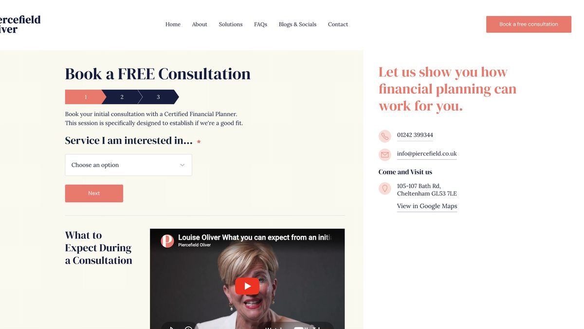
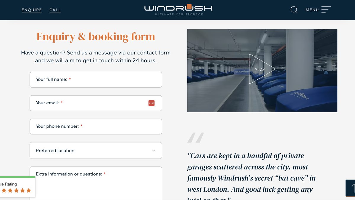
For a service page, that might be an enquiry, consultation or callback. For an ecommerce page, it might be choosing a product, checking availability or adding to basket. For a more complex B2B journey, it might be downloading useful information or comparing options before speaking to sales.
The route does not have to be aggressive. It just has to be obvious.
Build trust into the display
A good shop window does more than show products. It signals quality.
The lighting, layout, cleanliness, pricing, brand presentation and small details all affect whether someone trusts the shop before they enter.
A website has to do the same job.
Trust signals are especially important near moments of decision. Reviews, testimonials, case studies, accreditations, guarantees, secure payment messaging, delivery information, returns policies and clear contact details can all reduce hesitation.
The mistake is either leaving them out or placing them too far away from the point where the user needs reassurance.
For example, an ecommerce product page might need delivery and returns reassurance close to the add-to-basket area. A lead generation page might need proof of expertise, relevant testimonials or response expectations near the enquiry form. A high-value service page might need case evidence before the main call to action.
Trust should not feel bolted on at the bottom of the page.
It should be built into the journey where doubt is most likely to appear.
Give people a reason to act
A strong shop window often gives people a reason to act now.
That does not have to mean false urgency or aggressive countdown timers. In many cases, that kind of pressure damages trust. Urgency borrowed from the offer is credible. Urgency invented by the page is not.
The better approach is to make the value of acting clear.
For ecommerce, urgency might be linked to stock availability, delivery cut-offs, seasonal demand or limited offers. For lead generation, it might be a clear next step, a useful consultation, a response time, or a reason to start the conversation before the problem becomes more expensive.
The key is to avoid a passive page.
If the visitor understands the offer but feels no reason to take the next step, they may intend to return later and never do. That does not always mean the offer is weak. Sometimes the page has simply failed to make the next action feel worthwhile.
This is where copy and conversion design need to work together.
A button alone rarely creates motivation. The surrounding copy, proof, offer clarity and expectation-setting all influence whether the user feels ready to act.
Optimisation should not stop after launch
Retailers regularly refresh their shop windows because attention fades and behaviour changes.
Websites need the same mindset.
Too many sites are treated as finished once they go live. The homepage is signed off, service pages are approved, forms are built, and then the business moves on. But user behaviour keeps changing. Traffic sources change. Competitors improve. Search intent shifts. Paid campaigns send different audiences. New products, services or priorities emerge.
Conversion rate optimisation is the discipline of paying attention to those changes.
That does not always mean running complex experiments. Sometimes it starts with reviewing analytics, watching session recordings, checking enquiry quality, testing forms on mobile, or comparing how different traffic sources behave on the same page.
The important point is to keep learning from real users.
A website should not be treated as a static brochure. It is a working part of the marketing system, and it should be improved based on evidence.
Practical shop window test for your website
A simple way to review a website is to imagine it as a physical shop window on a busy street.
Ask yourself:
-
Would someone understand what we offer within five seconds? If the headline and opening section are vague, visitors may leave before they understand the value.
-
Is there one clear next step? If the page has too many competing actions, people may hesitate or choose none of them.
-
Does the page match the visitor’s intent? A user arriving from a specific search or ad needs the page to reflect what they clicked for.
-
Are trust signals visible before the decision point? Reassurance should appear where hesitation happens, not only at the bottom of the page.
-
Is the mobile experience smooth? Buttons, forms, menus and page speed can all affect whether users continue.
-
Does the page give people a reason to act now? The page should make the value of the next step clear without relying on false urgency.
-
Are you measuring quality as well as volume? More enquiries or sales are useful only if they are the right kind. Review whether visitors become qualified leads, profitable orders, repeat customers or other outcomes that actually matter to the business.
This test is simple, but it highlights the areas where many websites lose momentum.
Final perspective
Your website does not need to shout to be effective.
The best shop windows are not always the loudest or busiest. They are clear. They make the offer easy to understand. They show enough evidence to build confidence. They make the next step feel natural.
The same is true online.
A website that attracts traffic but fails to guide visitors is leaving value on the table. That is especially costly when you are already investing in SEO, PPC or other acquisition channels.
Good conversion rate optimisation is not about adding more noise. It is about making the page work harder by making the decision easier.
If your website were a shop window, the question is not only whether people would stop and look. It is whether they would understand enough, trust enough and feel ready enough to step inside.