When a business is paying for SEO, PPC, content or conversion work, a slow site quietly taxes all of it. It makes organic visits less valuable, paid clicks more fragile and enquiries harder to earn. The frustrating part is that the issue often sits below the surface. The page looks fine, the design feels finished and the performance score is “good enough”, but users are still waiting longer than they need to.
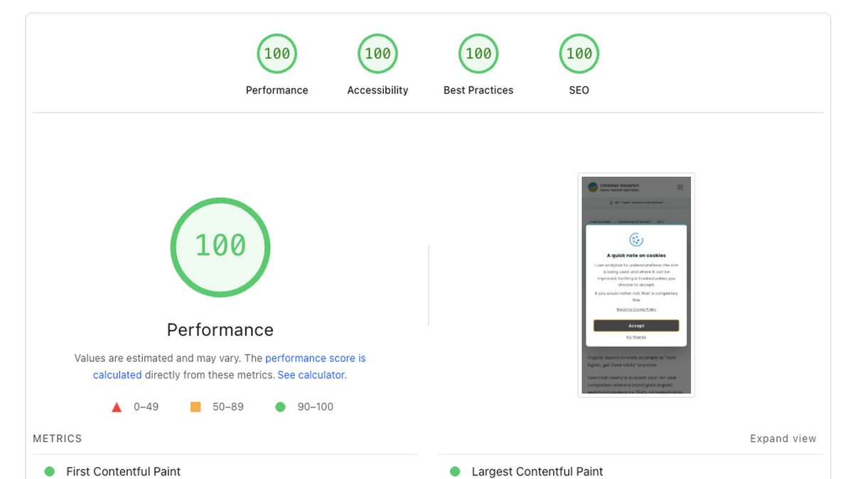
That was the position I wanted to avoid when I rebuilt goodrich.digital. Getting to 100/100 on Core Web Vitals and PageSpeed Insights wasn’t about chasing a badge, but about making sure the site had the technical foundation to support the commercial work around it.
I’m writing this up because the journey from a respectable score to a perfect one is rarely about a single dramatic change. It’s usually small, specific work in places that don’t feel obviously connected to performance: image variants, loading priority, script behaviour, font delivery and a few decisions about how much work the browser should have to do.
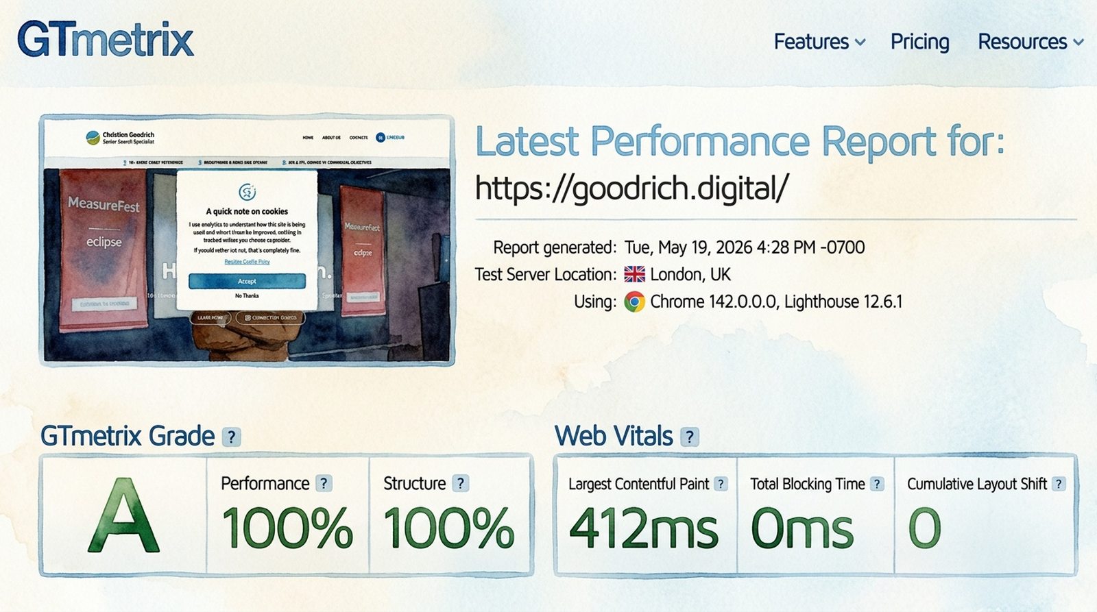
The current PageSpeed Insights report for goodrich.digital shows the final result. Below is how I got there, and what I’d check first on any ecommerce or lead generation site where marketing spend is being held back by the page experience after the click.
The commercial case for getting this right
It’s tempting to treat Core Web Vitals as a technical scorecard, but the more useful framing is that a fast, technically sound site supports three different commercial outcomes at the same time.
It helps SEO because Core Web Vitals contribute to page experience, and because faster, cleaner pages are usually easier for search engines to crawl, render and understand. It can help paid search because landing page experience is part of Quality Score, and speed is one of the signals that can affect whether a click turns into a useful visit. And it helps conversion, because every additional second between intent and rendered content costs you some proportion of visitors.
That’s the framing I keep coming back to with clients. The site isn’t the campaign, but the site can quietly hold the campaign back.
The starting position
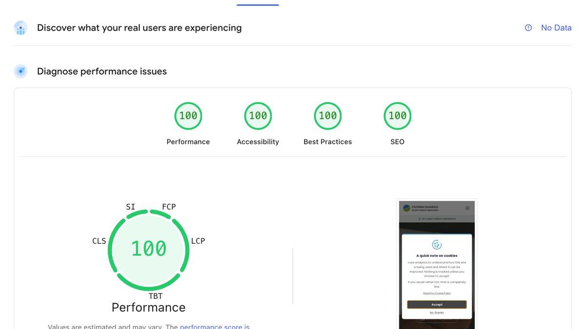
When I first ran the homepage through PageSpeed Insights after the new build went live, the mobile performance score was 88. Largest Contentful Paint, or LCP, sat at 3.1 seconds. First Contentful Paint, or FCP, was 0.9 seconds.
88 is the kind of score that looks fine until you start unpicking it. It’s the performance equivalent of “mostly fine”, which is rarely where the interesting work stops.
Anything in the 50 to 89 band is reported as “needs improvement”, and once the hero image and fonts started landing properly, the gap to 90+ was clearly closeable. The interesting question was whether 100 was realistic without the site feeling stripped back, or whether I’d have to compromise design and content to chase the number.
It turned out the answer was yes, but only by treating performance as several distinct problems rather than one.
Image weight, properly
The biggest single contribution to LCP on most sites is the hero image. On goodrich.digital, the hero is a wide photograph of me on stage at brightonSEO and MeasureFest. The original WebP was 67 KB at 1920×1080.

67 KB isn’t a large file in isolation. The issue is that mobile devices were downloading the full 1920-wide image even though their viewport only needed around 960 pixels of width. They were paying the bandwidth cost of pixels they’d never see.
The fix was responsive variants. I generated 960-wide and 1440-wide WebP versions, then re-encoded the 1920 master at a slightly more aggressive quality setting. The full set:
- Mobile, 960w: 15 KB
- Tablet, 1440w: 24 KB
- Desktop, 1920w: 38 KB
Mobile dropped from 67 KB to 15 KB, a 78% reduction, with no visible quality loss at the actual display size. I added a srcset and sizes attribute to the <img> so the browser picks the right variant automatically.
Below the fold, the homepage shows article cards that also use WebP. Those were already small, around 30 to 45 KB each, but they were encoded at a quality level higher than the display size required. Re-encoding the 15 card images at quality 72 saved another 58 KB across the page.
None of these images are the LCP candidate on the homepage, but they still matter. On slower connections, they compete for bandwidth with the hero image, tracking scripts, fonts and other resources. Reducing their weight gives the browser less to juggle, which makes the page feel cleaner and gives the most important content a better chance of rendering quickly.
Loading the hero image faster, not just smaller
PageSpeed Insights gives a useful breakdown of LCP into four sub-parts: time to first byte, resource load delay, resource load duration and element render delay. The smaller you can make each of those, the faster LCP fires.
The breakdown showed an 80 ms resource load delay on the hero image. This is the gap between when the browser could have started fetching the image and when it actually did. The cause is straightforward: the browser only knows the image exists once it parses far enough through the HTML to encounter the <img> tag.
The fix is a preload hint in the <head>:
<link
  rel="preload"
  as="image"
  href="/images/hero.webp"
  imagesrcset="/images/hero-960w.webp 960w,
               /images/hero-1440w.webp 1440w,
               /images/hero.webp 1920w"
  imagesizes="100vw"
  fetchpriority="high"
/>
This tells the browser to start fetching the hero image at the same priority as the CSS, before the body even starts parsing. imagesrcset and imagesizes are responsive-preload attributes, so the browser still picks the right variant for the viewport.
Between the responsive variants and the preload, LCP dropped from 3.1 seconds to 1.8 seconds.
For a user, that difference isn’t an abstract score improvement, but the difference between landing on a page that feels immediate and landing on one where the main content lags behind the click. For SEO and paid search, performance is part of the experience the visitor has after the search or ad has done its job.
The forced reflow nobody talks about
After the image work, I went looking for the next bottleneck. PageSpeed Insights flagged a 124 ms forced reflow attributed to a script on the homepage.
A forced reflow happens when JavaScript reads a layout-dependent property, like scrollY or offsetWidth, immediately after writing something that invalidates the current layout. The browser has to redo layout synchronously before answering the read, and that work blocks the main thread.
The culprit was my own header, which is always a humbling sentence to write.
A scroll listener was reading window.scrollY on every tick and calling setAttribute("data-scrolled", "") on the header so a subtle shadow could appear once the user scrolled past 10 pixels.
Two problems with that:
- The attribute write fired on every scroll event, not just when the state changed. Each redundant write invalidated styles, so the next
scrollYread forced layout. - The
scrollYread itself happened inside the scroll callback, which is exactly the wrong place for it.
The fix was to swap the scroll listener out entirely for an IntersectionObserver. A 1×1 pixel invisible sentinel sits 10 pixels from the top of the document. When the user scrolls past it, the sentinel leaves the viewport and the observer toggles the attribute.
The browser handles the geometry calculation natively, without my script repeatedly asking for layout information during scroll. No scroll handler. No scrollY read. No forced reflow.
The 124 ms forced reflow dropped to zero on the next PageSpeed run. The score went from 94 to 99.
This is the kind of performance issue that often gets missed because it doesn’t look like a big feature. It was only a subtle header shadow, but small scripts can still create main-thread work, and main-thread work affects how quickly a page responds to users.
Self-hosting fonts
The last step took the homepage from 99 to 100.
99/100 looked good, but it still felt unfinished. Anyone who’s ever stared at a report sitting one point below the next threshold will understand the irritation.
The PageSpeed Insights report flagged 109 KB of font files loading from Google Fonts as part of the critical request chain.
Google Fonts is convenient, but it costs you a DNS lookup, a TLS handshake and a CSS round-trip before the actual font files can start downloading. That chain sits in the critical path of every fresh page load. The fonts themselves aren’t large, but the network sequence to get to them adds up on a slow mobile connection.
I downloaded the eight WOFF2 files I actually use, four Poppins weights and four Libre Baskerville styles. I placed them in /public/fonts/, wrote the matching @font-face declarations into the global stylesheet and preloaded the two weights used above the fold.
While I was in there, I audited which weights the CSS actually referenced. Poppins 300 was being loaded for two small grey caption styles where 400 read identically at 15 pixels. I dropped the weight from the font set and updated the two cite rules to use 400. 13 KB saved with no perceptible visual change.
The result: same fonts, fewer files, lighter total payload, no third-party network leg.
That last point is commercial, not just technical. Font loading is one of those areas where brand presentation and performance can quietly pull against each other. The decision wasn’t to remove the brand typography, but to deliver it with less waste.
Other foundations I had already set
A few decisions taken earlier in the build also contributed, and they’re worth listing because they tend to be missing from sites that get stuck in the 70s and 80s.
Inline critical CSS. Astro is configured with inlineStylesheets: "always", which means the CSS is in the HTML rather than fetched as a separate request. For a single-page session this is a small cost; for FCP it’s a meaningful win.
Cookie banner deferred until after paint. The cookie consent modal is dismissed in JavaScript using requestIdleCallback, so it doesn’t block the first paint. The banner still appears within around 300 ms of the page being interactive.
Trailing-slash URL consistency. Every internal link, canonical URL and sitemap entry uses a trailing slash, matching the way Cloudflare Pages resolves URLs at the edge. This avoids a 308 redirect chain on internal navigation that was previously confusing Google Search Console into reporting pages as “Discovered, currently not indexed”.
WCAG-compliant contrast. Not directly a performance metric, but the accessibility score also reads 100. Buttons and links use a workhorse dark grey, #434343, that hits 9.7:1 against white. The brand teal and green are reserved for decorative elements only.
None of these alone get you to 100, but cutting corners on any of them costs you elsewhere on the report.
They also show why performance can’t be separated completely from wider site quality. A fast site with poor accessibility, inconsistent URLs or intrusive consent behaviour is still carrying commercial friction. The cleaner the foundations, the easier it is for the site to support the work being done in search, paid media and conversion.
Don’t stop at the homepage
Reaching 100 on the homepage felt like the work was done. Naturally, it wasn’t.
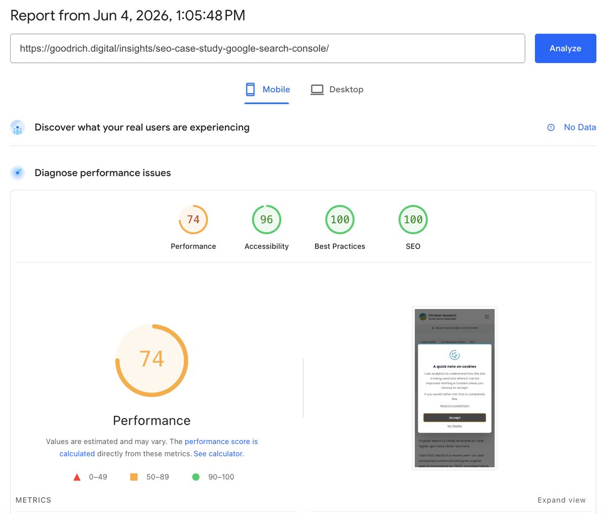
A few days later I ran the same report on one of the more SEO-important articles on this site, a case study about growing organic search impressions by 76%. The mobile performance score came back at 74.
That gap is bigger than people realise. Search engines rank pages individually, not sites. AI search systems and answer engines often draw on internal articles when they look for context to summarise. Paid search landing pages are usually deep internal pages, not the homepage. Branded search often lands on the page someone half-remembers, which is rarely the homepage either.
The pages that actually drive search visibility are often not the ones a typical performance audit starts with.
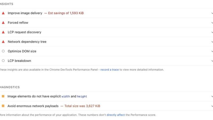
The article was being hit by the same kinds of issues the homepage had been, but at scale. The body carried three full-resolution conference photos at 4080×3072 native phone-camera dimensions, each over 1.5 MB. PageSpeed Insights was direct about it.
The fix was to apply the same ideas at template level so they would carry across the whole blog rather than article by article.
Bulk-compress every oversized image. I resized anything wider than 1600 pixels and re-encoded at JPEG quality 83 progressive. Across /public/images/blog/ and the brightonSEO/HeroConf folder, total image weight fell from 35 MB to 6 MB. The two flagged photos on the case study article dropped 84% each.
Generate smaller WebP variants for listings. The homepage Latest Insights cards and /insights/ listing rows now look for a matching -640w.webp file. That means listings serve 8 to 30 KB WebPs instead of falling back to full JPGs.
Preload the article hero in the layout. A single change in BlogLayout.astro adds a preload hint for whatever heroImage the article specifies. The browser starts fetching the likely LCP image earlier, and the “LCP request discovery” warning cleared.
Add width and height at build time. A small rehype plugin reads local image dimensions and adds width and height attributes to markdown images during the build. Future posts get the layout stability benefit without anyone having to remember it manually.
The point isn’t that each of these is a clever trick, but that the work belongs in the template, not in any one article. Once BlogLayout knows to preload the hero, every future post benefits. Once the rehype plugin is wired in, every future image gets width and height without anyone having to remember. You do the work once and every article on the site keeps getting the benefit.
If you only audit the homepage, you end up with a homepage that scores well and a body of work that quietly drags. The pages that drive your search visibility deserve the same attention as the front door.
Closing the last few points on the article itself
The template-level work moved the case study from 74 into the 80s on the next run. Closing the rest of the gap to 100 came from three smaller, more specific passes. They’re worth naming because they apply to most article-style pages, not just mine.
Tighten image dimensions to the actual display size
PageSpeed Insights computes its “Improve image delivery” savings against the 1x display dimension of each image, not against retina. An article rendered in a 645-pixel-wide content column will see anything wider than around 700 pixels flagged as oversized, even if 1200w looks crisp on a retina laptop.
I stepped every body image down to a 700w cap, and the single image still being flagged after that pass went one further: re-encoded as WebP at exactly 645w. The image-delivery panel collapsed.
The takeaway is that PageSpeed Insights’ view of “right-sized” is more aggressive than most responsive-image conventions allow for. If you’re chasing 100, the budget is the column, not the device.
Check accessibility contrast on small UI, not just body text
The accessibility score on the article was sitting at 96, two contrast failures away from 100. Both were on small bits of interface I hadn’t thought of as “text against a surface”: the pager links above and below the article, ”← Previous article” and “Next article”, were rendered in brand teal on a near-white background, delivering 3.47:1. The subscribe button label was dark grey on brand green at 3.77:1. Both failed WCAG AA for the 12-pixel uppercase label they were applied to.
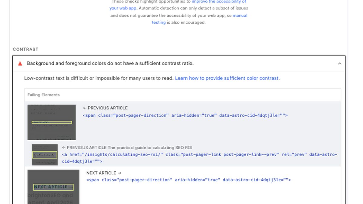
The brand colours are locked, so the fix had to sit on the text side. Pager labels became the workhorse dark grey at 9.6:1. The subscribe button label switched to near-black at 6.6:1. The brand identity stays unchanged; the contrast goes from failing to comfortably past AA. Accessibility moved to 100 on the next run.
Drop font preloads when they compete with the LCP image
This was the most counterintuitive change of the lot.
Earlier in the work, I’d preloaded four Poppins weights so the fonts wouldn’t be late-discovered through CSS. That reasoning made sense in isolation, and on the homepage the preloads helped. On the article, the LCP breakdown was telling a different story: the hero image was loading in 70 ms but taking over two seconds to render. The breakdown attributed the gap to element render delay rather than anything network-related.
Investigation pointed at the font preloads themselves. On simulated throttled mobile, where PageSpeed Insights runs at roughly 1.6 Mbps, each <link rel="preload" as="font" crossorigin> grabs an early connection slot. Four of them, at around 30 KB each, were competing with the hero image preload for the same window of bandwidth.
Because the @font-face declarations already use font-display: swap, the page paints with the fallback font immediately and never waits for the WOFF2 files to load. Preloading them was buying nothing for first paint and costing the LCP image its uncontested early bytes.
I removed all four font preloads. The fonts continue to fetch via @font-face once the inlined CSS is parsed. The fallback paints first, the Poppins weights swap in a fraction later, and the visual transition is graceful because font-display: swap was already on. The hero image preload now wins the race for early bandwidth on the simulated mobile profile.
The lesson here isn’t that preloading fonts is wrong, but that any preload is a claim on early bandwidth, and if you mark everything as a priority you end up prioritising nothing. On a page where the LCP candidate is an image, the image preload should win the race.
Practical takeaways
- Don’t stop at the homepage. Test the templates that drive visibility, enquiries and revenue, especially articles, category pages, product pages and paid landing pages.
- LCP is often about the hero image. Start with file size, responsive variants and
fetchpriority="high". - Add a responsive
<link rel="preload" as="image">for the hero where it’s the LCP candidate. It can save useful resource load delay without changing the visible design. - Size body images to the column they render in, not to the screen they might appear on. PageSpeed Insights’ savings calculator treats anything wider than the 1x display dimension as oversized.
- Treat preloads as a budget. Every preload is a claim on early bandwidth, and when too many compete, the LCP image can lose its early bytes. Where
font-display: swapis already in place, font preloads can cost more than they save. - Audit your scripts for forced reflow. A scroll listener that reads
scrollYand toggles attributes on every tick can quietly cost you performance. UseIntersectionObserverfor anything threshold-based. - Self-host fonts where it makes sense. The convenience of Google Fonts is real, but so is the cost of extra network steps on a fresh visit.
- Audit which font weights you actually use. Many sites load five or six and only use three.
- Inline critical CSS for static sites where the FCP gain is worth the caching trade-off.
- Defer the cookie banner with
requestIdleCallback, not immediately on page load. - Check accessibility contrast on the small UI bits, not just body text. Pager labels, button labels and uppercase 12-pixel directional cues are easy to overlook and just as easy to fail AA on.
- Mobile scores from a single PageSpeed run are noisy. Take the median of three to five runs before deciding whether a change moved the needle.
Questions to ask before chasing a higher PageSpeed score
Before chasing a perfect score, I’d check where performance is most likely to affect commercial results.
- Which templates matter most commercially: homepage, product pages, category pages, service pages, landing pages or lead forms?
- What’s the LCP element on those pages?
- Are mobile visitors downloading images larger than their screens need?
- Are fonts, third-party scripts, cookie tools or tracking tags sitting in the critical path?
- Are PPC landing pages being tested separately from the homepage?
- Are performance improvements being reviewed alongside conversion rate, qualified leads, sales, revenue or cost per sale?
- Has the score been checked across several runs rather than one PageSpeed test?
A technical score only becomes commercially useful when it informs a decision. On an ecommerce site, that might mean checking whether product and collection pages are slower than the homepage. On a lead generation site, it might mean checking whether paid search landing pages, embedded forms, call tracking scripts or cookie tools are adding friction at the exact point someone is deciding whether to enquire.
Final perspective
A perfect Core Web Vitals score isn’t the goal in itself. The goal is a site that loads quickly enough that visitors don’t feel friction, search engines can crawl and render pages cleanly, and paid clicks land on a page that gives the visitor what they came for quickly.
Performance often gets attention when scores are poor and then gets ignored once the score looks acceptable. I think that’s too narrow. The site is the foundation that ad spend, SEO investment and conversion work sit on. When that foundation is cleaner, faster and easier to render, the work above it has less friction to fight.
If your mobile score is sitting in the 70s or 80s, I wouldn’t assume the last 20 points require a rebuild. In many cases, the biggest gains come from a small number of specific fixes: image sizing, loading priority, font delivery, script behaviour and critical CSS.
The score isn’t the prize: the prize is a site that gives SEO, paid traffic and conversion work a cleaner foundation.
If this sparked a useful thought about your own site, connect with me on LinkedIn. I share practical notes on SEO, PPC, CRO, measurement and commercial performance.


